


Every click, swipe, and transaction leaves a trail of data, but without context, it’s just noise. Companies generate massive volumes of information on customer behavior, market trends, and operational performance, but raw data alone holds little value until it’s translated into meaningful insights. That is where data visualization comes into play.
Data visualization is more than creating charts and graphs; it's about transforming complex information into clear, interactive visuals to help drive smarter, data-driven business decisions. Through this visual display of information, organizations can uncover insights that would otherwise remain undetected within spreadsheets or databases, such as trends, patterns, and opportunities.
The emergence of new and powerful analytics tools is driving the adoption of AI in data visualization, fundamentally changing how enterprises view their performance and customer needs. Today, companies that are investing in robust visualization systems find themselves better equipped to compete, innovate, and grow in today's data-driven marketplace.
What Is Data Visualization and Why It Matters?
Data visualization, in other words, the visual representation of information and data with visual elements like charts, maps, infographics, or dashboards, gives businesses an advantage. It makes it easy for decision-makers to consume complex data quickly by displaying it in a digestible format. Furthermore, visualization provides clarity and less confusion in communication. Visualization helps different teams-- marketing, finance, operations, and management-- agree on insights in a common visual language. In this era of big data, the ability to make the complex simple is one of the most valuable assets.
With AI for data visualization, systems can automatically detect trends, forecast performance, or even highlight anomalies in real time. This helps businesses make faster, informed decisions with a greater degree of accuracy and less guesswork.
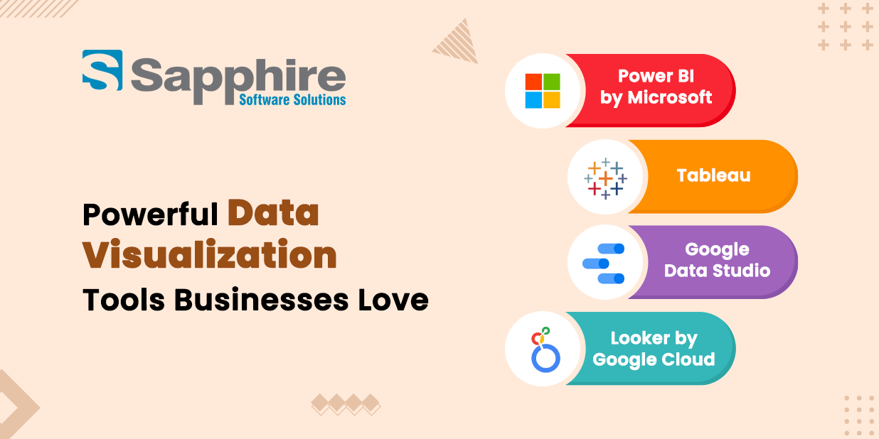
Powerful Data Visualization Tools Businesses Love:
Specialized data visualization tools help organizations bring their data to life by making it easy to design interactive dashboards and reports. Each of these tools has its strengths, suiting the needs of different organizations, from small startups to large enterprise companies.
The following are some of the most popular and effective data visualization tools in use today:-
- Power BI by Microsoft: With the help of Power BI, users can integrate data from multiple sources into dynamic, AI-driven dashboards for data visualization. It is intuitive, cost-effective, and integrates seamlessly with Office 365, making it ideal for businesses of all sizes.
- Tableau: Known for beautiful and interactive dashboards, Tableau lets users visualize complicated datasets in real-time. It supports several integrations with other data platforms and drag-and-drop simplicity for non-technical users.
- Google Data Studio: A free, user-friendly tool that visualizes data from Google Analytics, Ads, and many other sources. It's an excellent choice for marketing teams to track performance quickly and efficiently.
- Looker by Google Cloud: It is ideal for enterprise analytics. Looker provides a customized data model and integration with machine learning tools, making it perfect for predictive analytics.
Each of these tools enables businesses to convert data into insights; however, Power BI remains one of the most comprehensive and widely used platforms out there.
Effective Data Visualization Methods and Best Practices:
While tools are a significant consideration, the success of visualization rests on utilizing suitable methods and strategies. Selecting the proper approach is critical to clarity, accuracy, and significance.
Some typical methods of data visualization include:-
- Bar and Column charts- these charts are ideal for comparing categorical variables, or for showing change over time.
- Line charts tend to be the best for showing trends in time series data like sales or website traffic.
- Pie charts- effective for representing proportions or parts as a whole.
- Heat maps - highlight patterns, density, or frequency in the data.
- Scatter plots- identify correlations or relationships between two variables.
- Dashboards- combining multiple visualizations into an interactive space that offers a collective experience.
Best practice to consider when developing data visualizations:-
- Identify your audience- vary visuals based on the user; for example, an executive will want an overview summary, and an analyst will most likely want to see those details.
- Use colors- The different colors need to maintain a consistent color scheme; this will help guide the attention of users and eliminate confusion.
- Keep It Simple Stupid- avoid cluttering diagrams and help users focus on the primary metrics driving decisions.
- Be accurate- different data sources need to be validated for representation as well.
- Use interactivity- allow the user to explore the details in various ways.
When these methods and best practices are utilized correctly, you can transform your visualizations from a collection of graphics to a narrative tool that drives business decisions marked by informed discussions.
Unleashing Insights with Power BI:
From the many tools at hand, data visualization with Power BI has emerged as one of the most powerful platforms for businesses seeking deeper insights. Its seamless integration with Microsoft's ecosystem and AI-driven analytics makes it an ideal choice both for data professionals and non-technical users in equal measure.
Power BI allows organizations to connect data from spreadsheets, CRM systems, cloud platforms, and APIs into one unified dashboard. The AI inside the tool lets users interact naturally with their data through natural language queries and automated insights. Users can simply type a question, such as "What were the top-performing products last quarter?" in plain English and instantly see a detailed visualization.
Power BI also enables predictive analytics through AI integration, thus helping companies to foresee future trends, forecast the demands of their offerings, and strategize plans with a more realistic approach.
For companies looking for efficiency, Power BI provides real-time data streaming, allowing managers to track key metrics on sales, performance, and inventory in real time. This gets rid of the lag between collecting data and making decisions.
The Role of AI in Data Visualization:
As the volume and complexity of data grow, AI in data visualization is changing how enterprises communicate and understand data analysis. Traditional visualization methods often require users to preset the analysis and to interpret the results manually. AI, however, can facilitate a significant portion of the visualization process— making it faster, smarter, and even more insightful;
AI for data visualization allows visualization tools to uncover patterns, identify anomalies, and recognize relationships in datasets. It can aid users in discovering insights that users do not even know how to search for. For instance, AI algorithms can leverage patterns to identify unusual spikes in sales, indicate new relationships, and predict future behavior based on historical data.
AI-enabled visualization tools are also integrating public natural language processing (NLP) to better their interaction capabilities. When users type (or speak) questions such as, “Show me revenue last month by region,” the system instantly generates visuals based on the interaction.
AI also facilitates data story when applying visualization. In this sense, storytelling is dynamic as there is text describing the context of the data in addition to the visuals in the context. In enterprises dealing with a massive amount of analytical data, AI automation significantly reduces the time spent on data preparation (using data for decision-making).
Data Visualization Benefits for Modern Businesses:
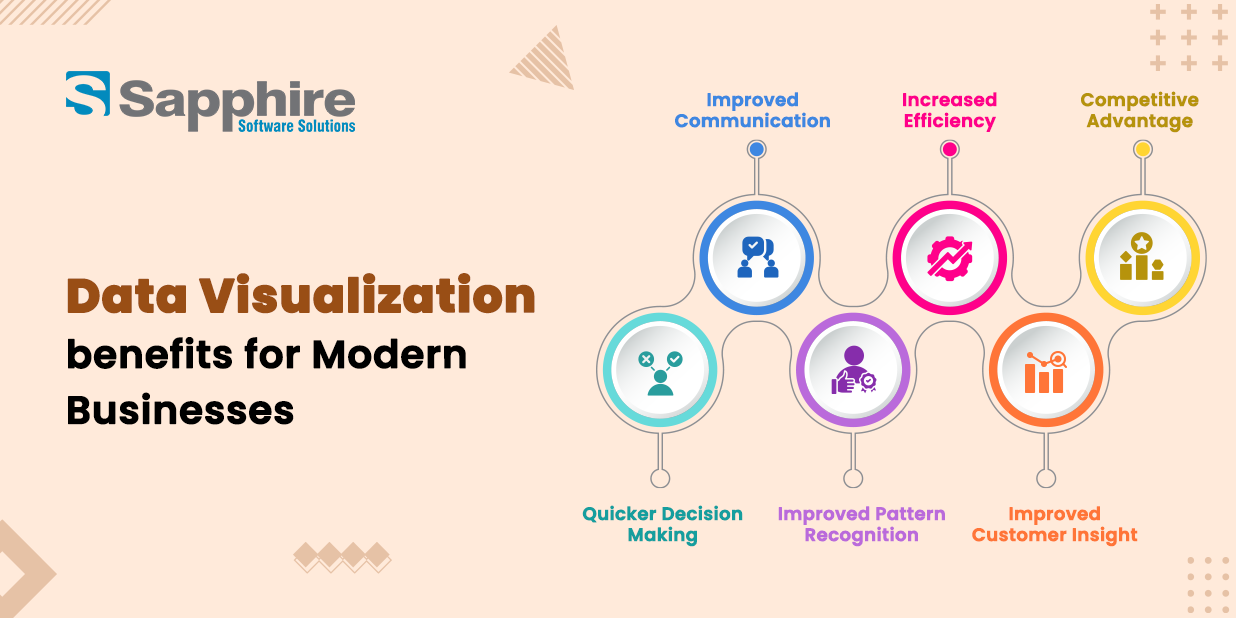
The advantages of data visualization to modern businesses go beyond just aesthetics; they are strategic and measurable:-
- Quicker Decision Making: Visualization presents data in a clear, visual manner, thus allowing executives to make quick, confident decisions.
- Improved Communication: Interdepartmental teams can communicate more effectively by using common visual dashboards.
- Improved Pattern Recognition: Visuals depict hidden trends and relationships that raw numbers cannot convey.
- Increased Efficiency: Reports and analytics can be automated, saving time and minimizing human error.
- Improved Customer Insight: Visual analytics expose customer behaviors, preferences, and levels of satisfaction.
- Competitive Advantage: Data-driven companies outcompete others simply through faster action upon insight.
Data visualization may be thought of as the lens through which businesses see their performances and remain agile in ever-changing markets.
Data Visualization Services for Enterprises:
Enterprises today require much more than just dashboards. They need end-to-end data visualization services integrated into their system and strategy. These services include data collection, cleaning, integration, visualization, and AI-powered analytics.
A professional visualization partner makes sure data is presented not only beautifully but also meaningfully interpreted. From real-time executive dashboards to predictive analytics systems, enterprise data visualization services create an opportunity for any organization to unlock its full data potential.
These services also stress scalability and security—vital for large enterprises with sensitive and regulated data. What's more, experts take advantage of AI in data visualization to automate routine processes and enable teams to be more innovative rather than performing manual analyses.
The goal for enterprises is clear: turn overwhelming data into clear, actionable stories that inspire better business strategies.
Why Businesses Choose Sapphire an Enterprise AI Development Company for Advanced Data Visualization Solutions?
Selecting the appropriate partner is vital to ensuring the effective execution of visualization and analytics implementation. Sapphire is a preeminent Enterprise AI Development Company specializing in the design of intelligent and scalable data visualization services that allow businesses to make smarter decisions with confidence.
Sapphire Software Solution's team combined AI for data visualization with best-in-class analytics to provide custom dashboards that deliver clarity, precision, and business value. The solutions are not a "one size fits all" model but are crafted for the client's industry, goals, and data ecosystem.
Whether it's integrating data visualization with Power BI, automated data reporting, or AI-enhanced predictive models, Sapphire ensures consistency in execution from phase one of "concept" to "deployment." Sapphire's method considers usability and scalability of the solutions and actionable insights designed to move organizations from data collection to data intelligence.
Sapphire's expertise extends across a myriad of industries, such as finance, healthcare, retail, logistics, and manufacturing, where companies operating within these industries must act rapidly and base their decisions on data to grow.
Conclusion:
In a world where data grows faster than decisions, the true edge lies in how clearly you can see and act on it. Data visualization transforms scattered information into meaningful insights that fuel smarter strategies and faster growth.
At Sapphire Software Solutions, we combine AI and advanced analytics to create intelligent visualization solutions that help businesses uncover hidden opportunities and make confident, data-driven decisions. Our tailored dashboards and predictive insights turn complexity into clarity—empowering leaders contact us today for more.
With Sapphire Software Solutions, your data doesn’t just inform—it inspires intelligent action.